SELECTED CASE STUDY
TECH STACK
React
YEAR
2025
The Solution
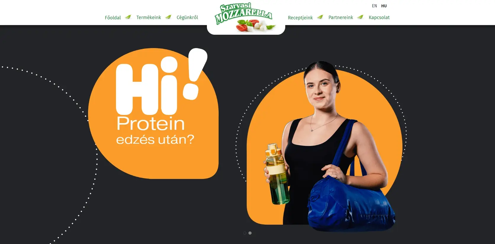
WebQuest developed the frontend experience for Szarvasi Fit, delivering a modern and responsive web interface built with React and Tailwind CSS.
The focus of the project was to translate the product and brand experience into a clean, accessible and consistent digital interface that performs well across desktop, tablet and mobile devices.
The implementation was structured around reusable frontend components and responsive layout patterns, creating a maintainable foundation for future content and interface updates.
Responsive Frontend Development
The entire frontend was built with responsiveness as a core requirement rather than as an afterthought.
Layouts, spacing, typography and interactive elements were adapted across different screen sizes to ensure a consistent experience on:
Desktop devices
Tablets
Mobile phones
Tailwind CSS was used to create a structured and scalable styling system while maintaining close control over visual consistency and responsive behaviour.
Component-Based React Architecture
The interface was implemented using React, allowing the frontend to be divided into reusable and maintainable components.
This approach made it easier to keep repeated interface patterns consistent across the project while reducing duplication and supporting future development.
Key areas of the frontend implementation included:
Reusable React components
Responsive page layouts
Structured Tailwind CSS styling
Mobile-first interface adaptation
Consistent spacing and typography
Reusable content sections
Cross-device usability
Maintainable frontend structure
Brand-Focused Implementation
A major part of the work was ensuring that the final interface remained visually aligned with the Szarvasi Mozzarella / Szarvasi Fit brand.
The frontend implementation focused on preserving the intended visual identity while translating the design into a responsive digital experience.
Care was given to layout hierarchy, spacing, typography, imagery and content presentation so that the site remained visually consistent across different devices.
Built for Maintainability
The result is a responsive React frontend designed to be easy to extend and maintain.
By combining reusable components with Tailwind CSS utility-based styling, the implementation provides a flexible frontend foundation that can support future content, layout and feature changes without requiring the interface to be rebuilt from scratch.
[Explore]